

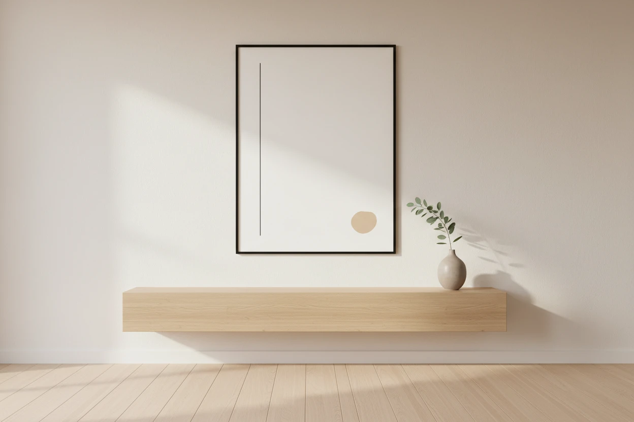
Designing Calm: 7 Rules for Using Minimalist Wall Art at Home
Authored by: Indre Saveike
Some rooms feel restful the moment you walk in. Others feel busy even when there’s nothing obviously wrong. Wall art is usually why – not what it shows, but how it was chosen. Here’s what I’ve learned from years of curating minimalist prints at Inprint Designs.
1. Choose one wall, not every wall
Empty walls are not problems to solve. In a minimalist interior, bare space does real work – it gives the eye somewhere to rest. Pick one wall per room as your focus and leave the others alone. One well-chosen piece always does more than a room full of competing art.
2. Scale up, not down
Small art on a large wall is one of the most common decorating mistakes I see. It makes the room feel tentative. A good starting point: your art should cover at least two-thirds of the wall width it’s on. If you’re unsure, go bigger.
One of the most common questions I get from customers is whether to go with the size they originally picked or the next one up. Almost every time, the answer is up. The room always looks better for it.
3. Follow the room’s palette, not your own
Your art doesn’t have to match your furniture – but it should belong to the same tonal world. Warm whites, natural wood, linen textures? Art in beige, terracotta or muted sage will feel at home. If you’re drawn to this direction, neutral tone prints are a good place to start. Art that clashes with the room pulls focus away from the space and onto itself.
4. Texture matters more than subject
In a calm interior, how a piece looks is more important than what it shows. A canvas with soft gradients and organic marks adds warmth the same way a linen cushion does. Before buying, ask: does this add texture, or just noise?
5. Eye level. Every time.
Art hung too high is the most common placement mistake I come across. Centre your piece at around 57–59 inches (145–150 cm) from the floor. Above furniture, leave roughly 6–8 inches (15–20 cm) between the top of the piece and the bottom of whatever’s beneath it.
6. Canvas or framed poster – both work, but differently
A stretched canvas without a frame feels warmer and more informal. It sits close to the wall and becomes part of the room. A framed poster with a thin black or wood frame is more structured – closer to a gallery feel. Neither is the right answer. It depends on the mood of the space.
7. Buy for ten years, not for this season
Trend-driven art gets tired fast. The pieces that still feel right years later were chosen for their calm and their quality – not because they matched a mood board at the time. Ask yourself: would I want this in a different home? A different decade? If yes, it’s worth it.
A room with good art feels more like itself – quieter, more settled. These rules won’t solve everything, but they’ll help you avoid the decisions that are hardest to undo.
Author Bio: Indre Saveike is the Founder and Creative Director of Inprint Designs, a minimalist wall art brand offering canvas prints and framed posters for modern homes.