27 Lessons Learned From Rebranding When Your Initial Brand Doesn’t Connect”
Rebranding after a failed launch requires more than a fresh coat of paint—it demands honest assessment, strategic pivots, and the courage to start over. This article brings together 27 hard-won lessons from business leaders and marketing professionals who have successfully rebuilt brands that missed the mark the first time. Their experiences reveal practical strategies for reconnecting with customers, refining messaging, and building a brand that actually resonates.
- Break From Past And Rebuild Confidence
- Find And Serve Your ICP
- Invite Beginners With Supportive Language
- Adopt Memorable Descriptive Identity
- Emphasize Safety Consistency And Care
- Sell Access And Velocity Not Price
- Own A Specific High Stakes Challenge
- Narrow To Law Firm Bookkeeping
- Choose A Name That Lifts You
- Drop Matchmaker Favor Partnership
- Say The Obvious Embrace Weird
- Specialize In Local Search
- Speak To The Problem Not Method
- Test Results Focused Value
- Address Real Life Fit And Ease
- Humanize Firms To Break Pattern Blindness
- Align Promises With Measured Delivery
- Build Trust Through Clarity And Service
- Highlight Creativity And Calm
- Guarantee Leads And Prove ROI
- Differentiate With Voice Values And System
- Center Evidence And Fairness
- Anchor Brand In Purpose And Integrity
- Probe Nonbuyers For Ground Truth
- Modernize Visuals To Evoke Emotion
- Show Real Work And Everyday Reliability
- Showcase Authentic Experiences And Conservation
Break From Past And Rebuild Confidence
The rebrand I learned the most from wasn’t a logo refresh. It was rebuilding trust in a market that remembered our predecessor failing.
In 2014 I co-founded NEWTON, a residential real estate development company in Romania. We acquired the land assets of a project that had been heavily marketed before collapsing in the 2008 financial crisis. The original brand had real market awareness – which sounds like an asset until you realize that awareness was attached to a failure. In Romanian real estate, where buyer trust is already fragile, inheriting a site the market associated with broken promises was the worst possible starting position for a new development.
The diagnostic was simple: research conversations with local buyers and brokers made clear that the old project name triggered immediate scepticism. People remembered the marketing. They also remembered nothing got built. Any attempt to trade on the predecessor’s awareness would have imported its reputation along with its name.
The decision: complete discontinuity. New name, new visual identity, repositioned project scope, different communication architecture. NEWTON was built to signal nothing in common with what came before: not a continuation, not a recovery, but a genuinely new entity that happened to be building on the same land.
What made the rebrand work wasn’t the new name or the identity system. It was the decision to change enough of the actual project – scope, specifications, smart home technology integration – that the new brand had something genuinely different to stand behind. A rebrand that sits on top of the same product that failed is cosmetic. Ours worked because the product underneath it had changed enough to earn a new name honestly.
Over 700 apartments sold across the NEWTON portfolio with zero commercial failures. The market that remembered the predecessor’s collapse became our strongest referral base once the first building delivered on time.

Find And Serve Your ICP
The biggest lesson for us wasn’t really about rebranding, it was about finding our ICP. Once we got that right, the rebrand kind of happened on its own.
Early on we positioned Branding5 as an AI branding tool. Sounded fine, but it put us in a bucket with logo generators and design toys. The customers actually getting value, founders, agencies, marketing teams, weren’t searching for that. They were looking for clarity on positioning, ICP, and messaging. We were showing up in the wrong conversation.
How we figured it out: we stopped looking at signups and started looking at what people did after they used the product, and how they described it to others. The happy users weren’t treating it like a tool, they were treating it as a strategy shortcut, something that replaced an expensive agency workshop. The word of mouth was describing a different product than our homepage was selling.
Once we saw that gap, the rebrand was almost obvious. New messaging built around outcomes instead of features, pricing that matched strategic value instead of tool value, and leaning into the agency use case we hadn’t even noticed at first.
The shortcut for anyone going through this: don’t start with the brand, start with your ICP. Find the people who already love the product and listen to how they talk about it. If there’s a gap between how you describe yourself and how they describe you, that gap is your rebrand.

Invite Beginners With Supportive Language
A rebrand that taught us a lot was for a fitness studio that thought their problem was visibility, when the real problem was perception.
Their branding looked very intense: dark colors, aggressive language, heavy focus on transformation photos. But when we started reviewing inquiry calls and website behavior, a pattern showed up. Beginners were visiting the site, then leaving quickly, while experienced gym users stayed longer. The business wanted everyday people, but the brand was accidentally attracting only hardcore fitness audiences.
The turning point came when one potential customer said, “I feel like I need to already be in shape before joining.” That single comment explained more than all the analytics reports.
Instead of rebuilding everything from scratch, we softened the messaging and changed the way the business introduced itself. We replaced phrases like “push past your limits” with clearer, more welcoming language around support, consistency, and beginner-friendly coaching. We also swapped staged transformation photos for real class moments that felt less intimidating.
Within a couple of months, the studio started getting more inquiries from first-time gym members, which was the exact audience they had struggled to reach before.
What helped us identify the issue wasn’t a branding exercise, it was listening carefully to the hesitation behind customer questions. Most rebrands fail because businesses only look at visuals, when the real disconnect is often emotional.

Adopt Memorable Descriptive Identity
A Casablanca legal services firm I worked with in 2024 was operating under a 3-letter initialism the founder loved and clients could not remember. The signal hit me when their head of business development told me she had spent 11 minutes on a sales call spelling out the firm name and explaining what it stood for. Eleven minutes that should have been on the actual matter the prospect needed help with.
We did not start with logos or color palettes. We started with 14 customer interviews. The same three things came up. Nobody could pronounce the name on first read. Nobody knew what the firm specialized in (corporate, IP, and labor law, but the brand said nothing). And referrals dried up because clients could not confidently recommend a firm they could not name out loud.
The rebrand swapped the initialism for a descriptive 2-word name pairing the founder’s surname with the practice focus. We rebuilt the website around three clear practice areas with one signature case study each. We rewrote the LinkedIn headlines of all 6 partners to follow the same structure. Total project ran 7 weeks at a cost around $11,000.
The identification process was the actual deliverable. The new logo and site mattered far less than the diagnostic. We tested the old name and the new name against 23 prospects in a 5-second recall exercise. Old name: 3 of 23 could repeat it. New name: 21 of 23.
Referrals doubled in the 6 months after launch. The firm’s signed-engagement rate from inbound inquiries went from around 1 in 9 to around 1 in 5. The lesson I keep going back to. A brand is not what you think it is. It is what your buyer can remember and repeat 30 minutes after the call ends. If they cannot repeat your name, the rest of the brand work is decoration.

Emphasize Safety Consistency And Care
When I started Green Planet Cleaning Services in San Francisco 16+ years ago, the original brand was straightforward and generic — clean homes, fair price. It worked early on, but as the Bay Area cleaning market got crowded, “another reliable cleaner” stopped resonating. We were attracting price-shoppers who churned within a few months and clients who treated my team like commodity labor.
The signal that the brand wasn’t connecting wasn’t a single moment — it was a pattern. Repeat customers were great, but our cost of acquiring new clients was creeping up, our average ticket was flat, and the inquiries we got were almost all comparison-shopping. Meanwhile, my actual best clients — the ones who stayed for years and referred friends — kept telling me two things in every review: “I love that you use non-toxic products around my kids and pets” and “I love that the same trusted team comes every time, not a new face.” Those weren’t features I was leading with. They were buried in the FAQ.
So we rebranded around what our best customers were already telling us: luxury eco cleaning, W-2 employees (not 1099 contractors), and consistency in higher-end SF homes. The change wasn’t cosmetic — it was clarifying who we were not for. Once we stopped competing on price with gig-based services and started speaking to homeowners who valued safety and continuity, the right clients found us, retention went up, and pricing pressure went down.
The biggest lesson: your brand isn’t what you say in your headline — it’s the sentence your loyal customers say back to you when they explain you to a friend. If those two sentences don’t match, that’s your rebrand brief.

Sell Access And Velocity Not Price
The first version of GpuPerHour was positioned as a discount GPU provider. We led with price in every piece of messaging, and our landing page looked like it belonged to a commodity hosting company. The problem was not that the positioning was wrong exactly. It was that it attracted the wrong customers and repelled the ones we actually wanted.
I identified the disconnect by looking at two data points together. Our trial-to-paid conversion rate was low, but the customers who did convert had unusually high lifetime value. When I interviewed those retained customers, a pattern emerged. They did not choose us because we were cheap. They chose us because we made it easy to provision high-end GPU clusters for ML training jobs without negotiating enterprise contracts or waiting for procurement cycles.
The realization was that our actual value proposition was speed and flexibility for AI teams, not low cost. We were solving an access problem, not a pricing problem. The customers who churned were price-sensitive hobbyists looking for the cheapest option. The customers who stayed were funded ML teams who valued time over cost.
The rebrand centered on three changes. We rewrote the messaging to emphasize on-demand access to production-grade GPUs rather than affordability. We redesigned the onboarding flow to speak directly to ML engineers instead of general developers. And we adjusted our pricing to reflect the value we actually delivered rather than undercutting competitors.
The result was a higher average contract value and significantly better retention. Fewer leads came through the door, but far more of them converted and stayed. The lesson I took from the experience is that a brand that tries to appeal to everyone ends up resonating with no one. Narrowing the audience felt risky at the time, but it was the decision that made the business viable.

Own A Specific High Stakes Challenge
Coming from Fortune 500 sales and marketing work with companies like IBM and AT&T, I learned early that customers don’t hire generalists when their expensive assets are on the line. When I launched Teak & Deck Professionals, I had to resist the temptation to market ourselves as an all-purpose outdoor services company, even though we technically could’ve offered more.
The signal that told me to narrow our focus came directly from customer conversations. Homeowners with weathered teak furniture or sun-damaged exotic wood decks weren’t looking for a handyman — they wanted someone who’d seen their exact problem a thousand times before. So we leaned hard into that specialization, and it became our identity.
That shift changed how we communicated everything — from how we answer the phone to how we give quotes. Our over-the-phone pricing is firm with no surprises, because after thousands of restoration jobs, we know exactly what we’re looking at. That kind of confidence only reads as credible when your brand is laser-focused, not scattered.
The practical takeaway: if customers are calling you but not converting, the problem is often that your brand is too broad to feel trustworthy for a specific, high-stakes job. Narrow down, own that lane completely, and your close rate will reflect it.
Narrow To Law Firm Bookkeeping
My first brand was too general. I’d positioned myself as a small business bookkeeper, and the conversations reflected that. Prospects were price-sensitive, expectations about what was included were unclear, and I spent most of my sales calls explaining the basics of what bookkeeping even was.
The rebrand didn’t start with design. It started with paying attention to which clients I already had the best conversations with. The law firms on my roster asked sharper questions, especially around trust accounting and three-way reconciliation. They understood the stakes of their books being wrong. And they were willing to pay for someone who knew the specific rules attorneys operate under, because the alternative was bar complaints and liability.
So I rebuilt the firm around that pattern. I narrowed the niche to solo and small law firms, made trust accounting and IOLTA compliance the visible center of the offer, and rewrote the site in language attorneys actually use when they talk about their books. The brand aesthetic followed, but the real work was in the positioning underneath it.
The way I knew it worked was the inbound shifted. Sales calls stopped feeling like education sessions. Prospects came in already understanding my work and why a law firm specialist was worth paying for. Fewer wrong-fit prospects made it through, and the ones who did were ready to hire.

Choose A Name That Lifts You
We rebranded from SwagHero to Merchwell in 2023, and the decision came down to a gap between what we were selling and what the name was telling people.
SwagHero sounded like exactly what most people in our industry are: a cheap promo company slapping logos on stress balls and koozies. That’s not what we do. We sell premium branded merch to companies that actually care about what their team wears and uses. Marine Layer, Travis Mathew, Nike. The kind of stuff employees take home instead of throwing out. But every time I’d get on a sales call and say “SwagHero,” I could feel the prospect putting me in a box I didn’t want to be in. The name was actively working against us at the higher end of the market we were trying to win.
The way I figured out the disconnect was just paying attention to the calls. Prospects would ask about pricing way too early, like they were already assuming we were the cheap option. We’d send over our actual catalog and they’d be surprised it wasn’t junk. That gap between expectation and reality kept showing up. When the same misunderstanding happens enough times, it stops being a coincidence. It’s the brand telling you something.
Merchwell came out of wanting a name that sounded like a serious company that took merch seriously. Not a hero, not a gimmick, just a real brand. The transition wasn’t fun. We had to update everything, eat some SEO pain, and re-introduce ourselves to clients who knew us by the old name. But within a year it was obviously the right call. The deals got bigger, the conversations got better, and we stopped fighting our own name on every call.
The lesson for any founder considering a rebrand is that your name is doing work whether you realize it or not. If it’s pulling you toward customers you don’t want, it’s costing you more than the rebrand will.

Drop Matchmaker Favor Partnership
So we thought our problem was the website. We help early-stage founders connect with investors and our positioning leaned hard on the matchmaking angle. Founders kept nodding politely on intro calls and then ghosting. That should have told us sooner.
What actually changed things was sitting in on 6 sales calls back to back and noticing the word “match” made people picture something dating-app shaped. They wanted a partner who understood the raise, not a vending machine. We rewrote the home page around what the founder is trying to do this quarter, not what we sell. Same service underneath. The deck and the site started saying the same thing for the first time. A lot of rebrands are really just the company finally hearing itself the way customers hear it.
Whether the lift is from new copy or from us being less confused when we talk, I cannot tell.

Say The Obvious Embrace Weird
When we first launched memelord.com I tried to sound like a legitimate SaaS company. Buttoned-up copy, neutral brand colors, language like “streamline your social content workflow.” Nobody understood what we actually did. The signal something was wrong wasn’t a single data point, it was the pattern in our sales calls where every prospect asked “wait, so what exactly is this?” If your brand is working, people arrive on the call already knowing. If they don’t, your brand isn’t doing the job.
The rebrand was really just permission to say the obvious thing out loud: we make memes for brands. We leaned into the irreverent voice that felt natural to us instead of the professional veneer we thought we needed. Changed the copy, changed the visual identity to feel more internet-native (we put floating eggplants on the pricing page, Lenny Rachitsky tweeted it as the best signup flow he’d seen). Conversion went up not because we found some clever new positioning but because we finally stopped hiding what we were. The lesson: most rebrands fail because they go bigger and broader. The good ones go smaller and weirder.

Specialize In Local Search
Our initial brand positioned us as COMPREHENSIVE DIGITAL MARKETING AGENCY serving all business types with all services. We discovered this wasn’t connecting when prospect consultations consistently showed confusion about what we actually did and who we served. Prospects would ask “so you do everything?” with skeptical tone suggesting the broad positioning created credibility concerns rather than appealing versatility.
The identification process: I analyzed 50 consultation recordings noticing prospects spent first 10 minutes trying to understand our focus rather than discussing their needs. The broad positioning made us sound generic rather than expert. One prospect directly said “I need specialists in local search, not generalists doing everything.”
We also tracked which prospects converted versus declined. Businesses seeking LOCAL SEO expertise converted at 41 percent. Those wanting comprehensive digital marketing converted at just 12 percent. The data showed our actual strength and market fit was local search specialization, not broad digital marketing.
The rebrand decision: we narrowed positioning to LOCAL SEO and LOCAL DIGITAL MARKETING exclusively, updated all messaging emphasizing local business expertise, and renamed the service offering to Thrive Local. The focused positioning immediately improved prospect conversations. Instead of explaining what we do broadly, we could dive into local search challenges specifically.
The connection transformation: consultation conversion rates increased from 19 percent to 34 percent after rebranding because prospects immediately understood our expertise and relevance to their needs. The narrow focus that initially felt risky actually created stronger market connection than broad positioning ever achieved.

Speak To The Problem Not Method
When ChainClarity launched, our original positioning was built around “whitepaper analysis” — we led with the document type instead of the user problem. The brand reflected that: technical, document-forward, aimed at people who already understood what blockchain whitepapers were.
The problem: the users who most needed the product were investors and researchers who had encountered whitepapers and couldn’t understand them — not people already fluent in the format. We were speaking to the solution (whitepaper analysis) when we should have been speaking to the problem (crypto projects are opaque and nearly impossible to evaluate without significant background).
How I identified the disconnect: I looked at the queries driving our organic traffic versus the queries we were optimizing for. People were finding us by searching “how does [project X] actually work” and “is [token Y] legitimate” — problem-framed searches. They stayed because we solved that problem. But they were leaving the homepage faster than they should have because the homepage language assumed familiarity with the artifact (whitepapers) rather than addressing the frustration (opacity of crypto projects).
The rebrand wasn’t a new logo or name. It was a positioning pivot: we rewrote the homepage, category pages, and meta descriptions around the user problem rather than the technical method. Trial-to-subscriber conversion improved measurably in the quarter following.
The lesson: brand disconnects are usually visible not in what users say, but in the gap between what brings them to you and what you’re saying when they arrive.

Test Results Focused Value
Initially, we discovered that customers were not connecting with our brand name because they did not recall it and/or trust it even though there was sufficient activity on the product. There was adequate site traffic but low conversion (purchase) and return (repeat purchase) rates. I have observed this situation many times before where the user experience signals have provided some evidence of poor performance, however, these signals show up through behaviors while prior research (i.e., surveys) indicate that the brand is not performing well. We also used simple metrics such as site drop off rates on key pages, insufficient unique direct traffic, and poor brand recall rates (through user feedback) to assess the problem. From this data, we confirmed that the product is fine, and the issue lies with how we are positioning the product to the customer.
We basically redefined our product’s value proposition before we attempted to be creative with the rebranding effort. The focus for the messaging changed to be outcome-oriented (i.e., passing the exam, building your confidence) rather than vague brand positioning statements. We tested the new messaging in a variety of small ways (e.g., changes to landing pages, text used in emails, and text used in onboarding screens) prior to making a full rollout. In almost every case, there was a noticeable improvement in conversion rates (i.e., the percentage increase in purchases) at the page level of at least 10 to 20 percent, thus indicating that we were going in the correct direction. The important lesson learned is that if you can validate a new message through the behavior of real people prior to committing to a full rebranding initiative, it will help ensure your success.

Address Real Life Fit And Ease
Mariner launched in 2022 positioned as ‘affordable premium menswear for the modern man.’ The brand promise was broad. The visual language was minimalist in a way that could have been any DTC label from 2020 onward. Six months in, we had decent traffic and poor conversion. Revenue was $14k monthly against $22k in ad spend. We were paying customers to buy products instead of the other way around.
What we identified: the brand was not speaking to anyone specifically. Every piece of copy tried to be universal, and universal doesn’t sell. The first thing we changed was interviewing 12 existing customers, asking what they had almost bought instead and why they picked us. Two patterns emerged. They all mentioned fit in a specific way (one size up from what other brands sold), and they all said something about ‘not looking like I tried too hard.’
That second phrase became the wedge. We rebranded from ‘affordable premium’ to ‘for men who wear their clothes, not the other way around.’ The visual system shifted from minimalist product shots to natural environments, shot on film, people doing actual things. Logo stayed but the type treatment softened.
How we identified what had to change: we read every customer service email from the first year. Patterns in complaints are the most honest brief you will ever get. The complaints we kept hearing were about how clothes ‘felt too fashion-y in real life’ even though photos looked understated. That told us the product copy needed to lower the stakes, not raise them.
Results 12 weeks post-rebrand: return rate on new orders dropped from 18% to 9%. Conversion rate on desktop went from 1.1% to 2.8%. Customer acquisition cost halved because the same ads were converting better. The quantitative side was strong. The qualitative side was stronger. Customer service emails stopped asking ‘is this for me?’ and started asking ‘when is the next drop?’
The biggest thing I learned: if you are not converting, the brand is broken before the product is. Fix the brand first, then work backwards.

Humanize Firms To Break Pattern Blindness
We work exclusively with law firms, so I’ve watched the same brand failure pattern play out dozens of times. A firm invests heavily in SEO or paid ads, traffic comes in, and nothing converts—because the brand itself is repelling people the moment they land.
The tell for us was always when a firm’s site looked identical to every competitor in their market. Same blue palette, same gavel imagery, same stock photo of a handshake over a mahogany desk. Potential clients in crisis are already cognitively overloaded—if your brand doesn’t create a pattern interrupt in the first few seconds, you’re just another forgettable option they bounce off of.
The diagnosis process I walk firms through is brutal but simple: pull up your site alongside your top three local competitors and screenshot them side by side. If you can’t immediately identify which one is yours, that’s your problem right there—not your ad spend, not your SEO.
The fix usually starts with replacing the institutional aesthetic with something human. Real photography of your actual team, a color palette that actually differentiates you, and video that lets a potential client hear why you practice law. That shift—from cold institution to real people—is where conversion rates actually move.

Align Promises With Measured Delivery
As Marketing Manager for FLATS, I use a data-driven approach to identify where our brand narrative fails to meet resident expectations. By analyzing systematic feedback through platforms like Livly, I pinpoint exactly where the customer experience deviates from our marketing promise.
At The Rosie, we pivoted our strategy to focus on ORI Expandable Studios after recognizing a need for more functional urban living in Chicago’s Pilsen neighborhood. These units feature “Pocket Studio” technology with moving walls, allowing us to rebrand the space from a simple studio into a multi-functional one-bedroom alternative.
To support this, we integrated rich media like 3D tours and in-house unit-level videos into our sitemaps. This shift led to a 25% faster lease-up process and a 7% increase in tour-to-lease conversions by demonstrating the tangible utility of the technology.
We also addressed move-in friction by creating maintenance FAQ videos for common resident hurdles, like operating ovens. This specific brand-alignment fix reduced move-in dissatisfaction by 30% and significantly improved our positive review sentiment.
Build Trust Through Clarity And Service
I’m in a good position to answer this because I’ve built trust in two worlds that depend on credibility: healthcare as a Registered Dietitian Nutritionist and HVAC as the owner of Roman Air Cooling & Heating. In both, if people don’t quickly understand your value, they move on.
The biggest signal that a brand isn’t connecting is when customers don’t feel clarity or trust. What helped us was listening closely to reviews and service calls, and the pattern was clear: people responded to thoroughness, transparency, professionalism, and feeling educated instead of pressured.
So the change wasn’t just cosmetic—it was operational and messaging-based. We leaned into what customers were already praising: walking them through issues, taking photos, clearly separating what was essential vs. optional, offering 24/7 emergency service, flexible financing, and emphasizing that we’re veteran-owned and service-driven.
A concrete example is how customers now specifically mention that our quotes are transparent and that they appreciate knowing what’s necessary versus an add-on. That told me the brand needed to communicate peace of mind and trust, not just “we fix AC,” and once your delivery matches that message, the brand starts connecting.
Highlight Creativity And Calm
As soon as we began expanding ROKR internationally we found out that the initial representation of our brand to consumers beyond our main supporter group did not resonate with those customers. Our products were great, but our communication was overly technical. It did not effectively communicate the creative, relaxing and storytelling aspects of people’s experiences in creating our 3-D puzzle products. I identified this by analyzing consumer input, decreased conversion rates in some of our international markets, and that many times people would perceive ROKR solely as “wooden models” rather than a creative lifestyle brand. The difference between their perceptions and their actual experience of ROKR was the indication for me that an adjustment had to be made.
To understand which aspects of ROKR need to change, we have been taking a tremendous amount of time to listen to all types of consumer feedback (directly from customers and indirect through online reviews, social media and at the retail partner level). Additionally, we analyzed how people use our products — they are using our puzzles not just to assemble, but as a means to describe their experience of calmness and disconnection from screen time. This understanding helped us see that our brand story should transition from merely discussing the features of our products, to imagination, creativity and a connection on an emotional basis.

Guarantee Leads And Prove ROI
After 20 years in web development and technical roles at JPMorgan Chase, I realized that for local contractors, a beautiful website is useless if it doesn’t ring the phone. I rebranded J&A Digital Solutions from a general web firm to a “Solutions-First” agency after seeing how many business owners felt like they were gambling their money away on marketing.
I identified the need for change by focusing on the 500% increase in “near me” searches and creating a “5 Lead Guarantee” to remove the risk for my clients. This moved our messaging away from technical jargon and toward the measurable ROI that service businesses like electricians and HVAC companies actually care about.
We stopped selling one-off websites and started providing a proprietary lead generation system that includes tools like our GetReviews4.Us app for local authority. This shift allowed me to build a family-run business centered on integrity and long-term results rather than just code and design.

Differentiate With Voice Values And System
With my decade at Northrop Grumman in competitive intelligence and international business development, plus founding Technology Aloha in 2012, I’ve honed rebranding through frameworks adopted across major units.
For Tech Partners Hawaii, an IT MSP, we spotted their brand wasn’t connecting because it blended into a crowded commodity market lacking cultural resonance in Hawaii.
We identified changes via competitor analysis to shape positioning, then drilled into core questions: why their brand exists, who benefits most, and their unique voice—revealing needs for new logo, colors, fonts, and messaging tone.
This systems-thinking approach, drawn from my defense background, built a branding guide ensuring consistent evolution, now guiding their client docs and bids.

Center Evidence And Fairness
I realized our initial brand was not connecting when hiring managers kept telling us they saw many “perfect” resumes but lacked proof a candidate could do the work. We rebranded Testlify around a skills-first, evidence-based message that emphasizes role-relevant tasks, case prompts, and structured interviews. We identified what needed to change by listening to those repeated customer patterns and by tracking which assessment signals predicted better hires. Making fairness and measurable, job-relevant signals central to our positioning guided the changes in both product and messaging.

Anchor Brand In Purpose And Integrity
As someone who’s lived through a massive personal rebrand—from homelessness to building four companies—I’ve learned that brand connection goes far deeper than just messaging or visuals. For me, it always comes back to aligning with a genuine purpose and being radically honest about what you truly stand for.
I’ve found an initial brand isn’t connecting when there’s a fundamental misalignment between the stated mission and the true values of the leadership or organization. This often manifests as a subtle lack of authentic resonance, where customers sense a disconnect behind the packaging, and I identified it by feeling a profound internal lack of “stickiness” or integrity.
My company, Faebl Studios, truly connected when we leaned into our “Recovery First, Always” principle and focused on “Work That Serves” addiction treatment centers. This wasn’t a logo change; it was an organizational re-commitment to a mission, allowing us to become the leading agency in that niche.
The rebranding wasn’t about superficial changes, but about realizing “You Can’t Build a Business Stronger Than You Are.” My personal journey of rebuilding taught me that true connection, whether personal or professional, stems from integrity and an authentic purpose that genuinely resonates with your audience.

Probe Nonbuyers For Ground Truth
Here’s how I detected and resolved a critical brand mismatch that almost derailed my agency’s traction. I’m sharing how you can use a simple “discovery call” trick with any offer to uncover brand disconnects that self-assessments won’t reveal and that can wreak existential havoc with your company.
Discovery calls are an untapped opportunity to ground truth brand misalignments that you haven’t been able to uncover on your own.
What saved us from doubling down on original brand misalignments is allowing opposition to ground truth our perceptions through free discovery calls, not only with leads but with people who didn’t transact with us. We started off strong, but there’s a stretch where our deals stopped short of completion, and the people we speak with started describing our services uncomfortably off. We internally chalked it up to copy and value proposition issues, and none of us had the chance to untangle the core of it.
What we failed to see is that we haven’t started running 20-minute free discovery calls with people who didn’t purchase or avail of our product or services. We started shaping short, structured time to conduct open and direct questions with non-paying clients regarding their experiences with our website, what they have remembered about the messages we put out there, why they didn’t purchase our product or service against our competitors, and other questions we found relevant.
We then started consolidating the recurring patterns of their responses. We realized through this ground truthing method that our word of mouth was that we’re just “another link vendor” despite all the copy we have regarding the relevancy and overall quality of the links we provide compared to others. The opposition and untrained eyes have proven that the tone of our brand, our product naming, our visual asset, our entire package screams commoditized marketplaces we’ve long believed we transitioned from.

Modernize Visuals To Evoke Emotion
With over 25 years leading CC&A Strategic Media, specializing in psychologically informed branding, I’ve directly handled rebrands that transform disconnects into connections.
We spotted our initial brand lagging when data from Statista and SimilarWeb revealed competitors dominating visual trends while ours felt dated—stale fonts and generic graphics failing to elicit emotional responses.
The fix was ruthless: apply “focus, simplify, choose” rules to refine our identity, then craft custom logos and graphics matching our modern, art-plus-science vibe, like overhauling visuals for website and social campaigns.
This data-driven pivot built resilience, turning audience indifference into recognition that sticks.
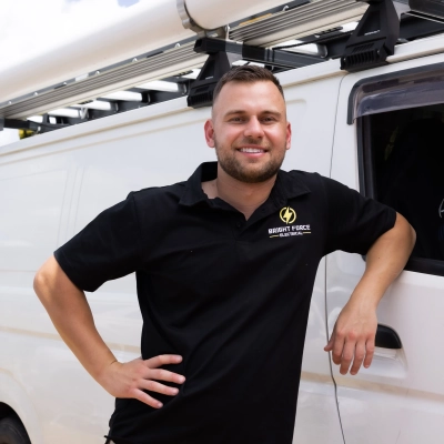
Show Real Work And Everyday Reliability
For us, the “rebrand” didn’t come from a big planned decision. It came from noticing, over time, that the way we were presenting ourselves wasn’t really matching how we actually worked or how customers were choosing electricians.
We’re a family-run electrical business, and when we first started trying to look more “professional” online, we leaned into very polished branding, generic service descriptions, and quite formal messaging. On paper it looked fine, but the type of enquiries we were getting didn’t really reflect the kind of work we actually do or the kind of customers we work best with.
The real turning point was when I started paying more attention to the conversations after jobs. A lot of our best feedback wasn’t about branding or marketing at all. It was things like “you explained everything clearly,” “you were respectful in the house,” or “you actually turned up when you said you would.” That made me realise there was a mismatch between what we were showing online and what people actually valued about us.
We also noticed that a lot of clients weren’t finding us through “perfect” marketing, but through word of mouth or because someone had seen how we worked on a job site. That was a big clue that our real brand wasn’t the polished version we had online, it was the way we actually operated on the tools and in people’s homes.
So instead of trying to look more corporate, we shifted towards being more honest and straightforward in how we present ourselves. We started showing more real job sites, more of the day-to-day work, and focusing less on trying to sound like a big company and more like who we actually are.
What changed after that was interesting. The enquiries we got were better aligned with the kind of work we do, and customers already had a more accurate expectation of how we operate before we even arrived on site. It made everything smoother, from quoting through to delivery.
If I had to sum it up, I’d say the biggest lesson was that the brand people connect with isn’t always what you design in marketing. It’s what they experience when you turn up to their home and do the work. Once we aligned the two, everything felt more natural.
Showcase Authentic Experiences And Conservation
As the Founder of My Safari Lodge, the turning point came when we realized our original brand was built around what we loved about safaris, not what our customers were actually searching for or emotionally connecting with. We positioned ourselves as a luxury retreat, but feedback, low engagement rates, and weak inquiry conversions showed a mismatch. Guests weren’t just looking for “luxury”; they wanted authenticity, storytelling, and a deeper connection to nature and local culture.
To identify what needed to change, we leaned heavily on customer data and direct conversations. We analyzed booking patterns, reviewed inquiry emails, and conducted post-stay surveys. A key insight was that our audience valued personalized experiences and meaningful wildlife encounters more than generic luxury messaging. We also studied competitors who were outperforming us and noticed they were leading with experience-driven narratives rather than amenities.
The rebrand focused on aligning our identity with those insights. We refined our messaging to highlight immersive safari experiences, local partnerships, and conservation efforts. Visually, we shifted from a polished, corporate look to something more organic and story-led. The biggest lesson was this: rebranding isn’t about changing how you look, it’s about recalibrating how well you listen.